The Dada movement, in short, was a movement that emerged amid the First World War (1914 -1918) as areaction to the conflict that consisted of artists of whom rejected reason, logic and aestheticism of the capitalist society and expressed the downfall of social structures; corruption, anti-bourgeois and supporters of left wing politics.
The Dada workshop was a short one day workshop in my studio whereby, me and the rest of the graphic design students were given the task of creating compostions inspired by the dada movement.
Working alongside a fellow student, we both scanned through old magazines in which we would cut out material and use collage to form a piece of work. As this was an experimental workshop, we decided to focus on a single theme of using only words begining with the letter ‘D’ ( as influenced by the name Dada). Browsing the magazines, we started to select words that could be rearranged in to sentences that were unconventional and like the dada movement, had an absurd, comical quality to the phrases that made little sense.
The format of the compostion was to just be a long strip of paper so that we could create a long, continousentence. I found the techniques and materials used in the workshop ( collage) were helpful and have since then, used collage and paper in many of my projects.
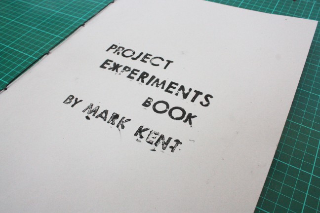
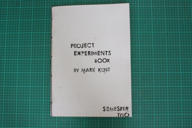
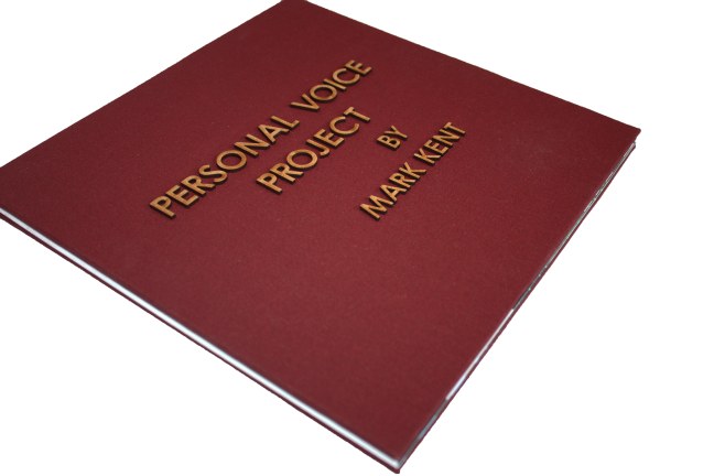
Having collected up all the experiments I had produced throughout this semester, I decided to compile them altogether and create a large A3 size book. This seemed like the most approrpriate option to present my experimentations instead of them beingcompiled as loose sheets of paper with no structure.
The first task was to cut the loose sheets down to an appropriate size so that they may fit the book pages. This in itself was timeconsuming due to the sheer volume of loose sheets of paper. Granted, some of the experiments were duplicated a number of times with varying results. Therefore, I selected the ones from these that I thought were most successful.
Creating the book fairly simple; single sheets of thick paper sewn together using japanese stitching with a cartridge paper cover. The experiments were then then fixed in the book using spray mount. When determining which experiments to place in which order, I used the same narrative structure as my projects.
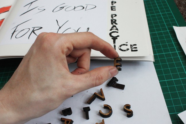
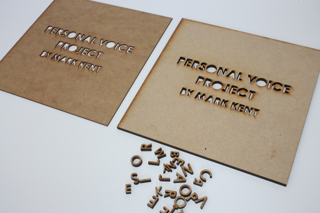
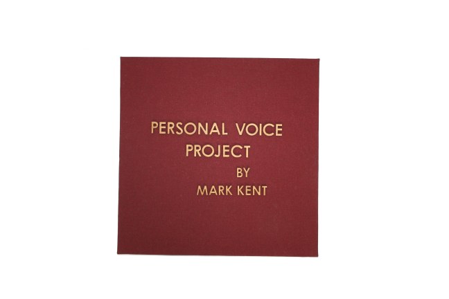
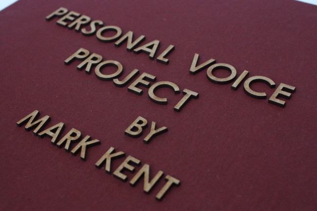
When adding the title and my name on the book cover, I wished to choose a method and medium that related to the content of the book. Therefore, with the spare wooden block letterforms I had produced by laser cutting for my personal project, I used these alongside block printing ink to create the the typography for the cover and title of the project experiments inside. unfortunately, a couple of wooden letter stamps that I required for a particular word did not exist as I had not had them laser cut. However, this was simple to adapt as I used a brush to draw the letter instead.
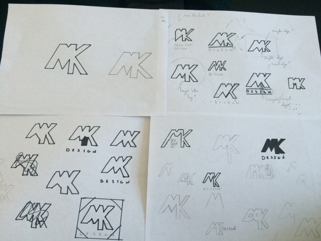
In addition to projects set by the university course, I also enjoy setting my own projects and outside work. Having set up a new instagram account as a portfolio to showcase my work, I thought designing a personal logo idea. The logo may not be a final logo, but it serves as useful practice in this area of branding and logo design.
I intially set about sketching ideas based on using the first letters of my forename and surname – m and k. Upon my intial sketching, I found that the M and K are letters that can be joined visually. Admittedly, it was difficult to think of an aesthetic message my logo would communicate as I was designing for myself without a clear specific area of design I am interested in, compared to a company or buisness that offers a specific service or message. I therefore, decided on a lettermark logo which was simple and readable.
Scanning in the sketch digitally and importing in to Adobe Illustrator allowed me to edit the design and to fix minor mistakes and details. I also explored using shapes to act as a container and found that the design looked best within a circle. The colour palette of the design was experimented with includiing black, white, blue, grey. These were colours that did not neccesassrily symbolise any particular message in accordance with colour theory. However, blue is a colour that represents loyalty, trust, confidence and intelligence amongst other characteristics. Furthermore, another colour combination of black and white looked simple but professional.
Changing the stroke weight of the letter outlines had an effect on the boldness of the logo
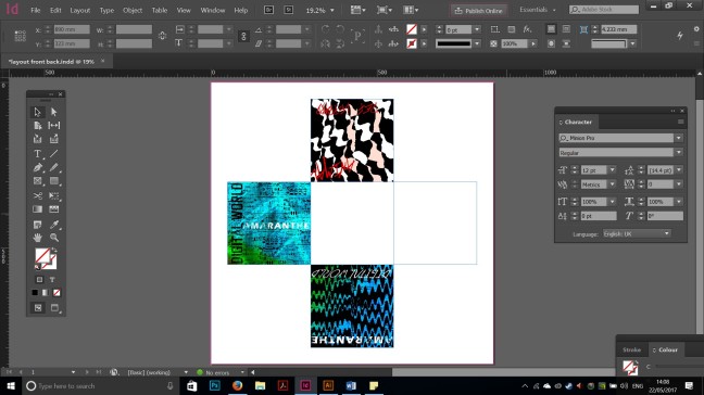
Having selected my final designs, my next task was to combine them in the form of a book as a final outcome. Instead of a more conventional book, whereby the pages are simply turned from right to left, I was determined to create a book that was more interesting to view and would compliment the size of the designs. It was therefore decided, one would make a fold out from a cube shape.
It was important to determine the measurements and the way in which the book would fold out. I started to create a small maquette of the foldout book using paper and thin card. For the purpose of the test maquette, the square pages would measure 10 cm x 10 cm but of course, the actual scale size of the pages would be 25 x 25 cm, making the book very large when fully opened out.
When deciding which album cover designs to be postioned on each page, I felt it best to sit similar designs together in accordance with their music genre to give a sense of narrative.
One side of the book in a net cube layout.The other side of the layout. The two white squares are blank pages as these are pages that will join with the hardback cover.
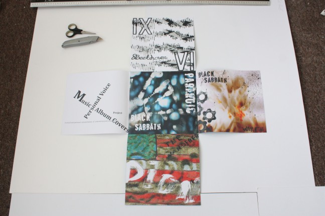
When the layout was finalised, I comverted the file to a pdf and sent it off to be printed. Both sides were printed on individual A0 sheets as they were very large; it was thena question of carefully and accurately cutting the the net out of both sheets and mounting them back to back. This was particular difficult due to the paper stock being quite 80GSM for each side and therefore, was challenging to perfectly align the edges with both sides once spray mouting chemicals had been applied to the sides. However with, patience and focus, this was achieved.
Once folding the book using the edges of the centre page as gudielines, I was forced to cut small notches in the corners of the middle page. This was to allow the other pages to fold in evenly and smoothly as folding them before I cut the small grooves, the pages would conflict with eachother and overlap considerably.
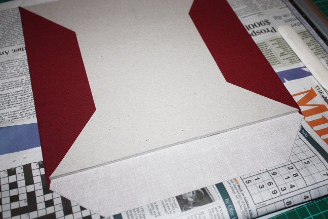
The next stage was to create the hardback book cover. This is something I have had experience with on other projects and was fairly simple. Instead of using two pieces of hardboard for the back and front cover, I added an additional two to make the covers more sturdy and resistable. Having measured the hardboard cover to the size of the paper foldout, I also added a little more space around all edges so that the cover would slightly overlap the book pages. The covers were then glued toegther and I proceeded to add fabric to each cover.
To finish my book, I thought of the idea of laser cutting typography that would form the title of the project and my name. Hvaing selected a simple and readable typeface, I prepared the file for laser cutting onto MDF which I would then place on the front cover. The thickness of the wood was 6mm, creating a bold and three dimensional set of text.
Intially, I had attempted to place the wooden text underneath the fabric of the cover so the the letterforms would create a three dimensional effect from underneath the fabric.
However, the material of the fabric was too rigid and and not flexible enough to be pushed around the wooden letterforms. I therefore, made the decision to place them directly on top of the cover s that they would be visible.
Furthermore, one felt that the 6mm MDF was too thick and produced a second laser cut group of text using 2mm instead. This was far more appropriate as it still offered a three dimensional aesthetic but one that was more subtle.
Both 2mm and 6mm laser cut letterforms. With the thicker 6mm, I kept these instea dof wasting them as they would be potentially useful as small block printing stamps.
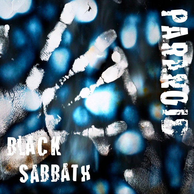
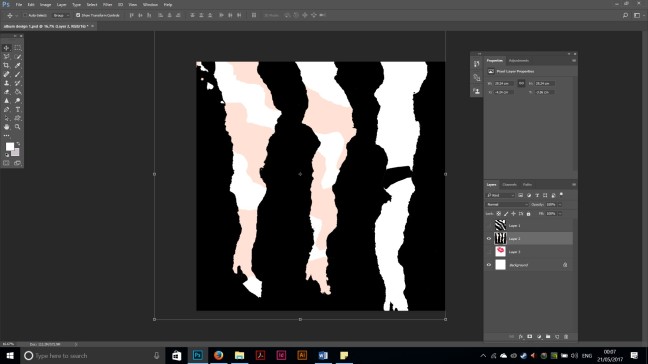
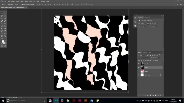
By sharing the same experiments I had made for the previous album design for ‘War Pigs’, I came up with a number of possible design covers for for the second Black Sabbath song in this project – ‘Paranoid.’
The themes of ‘Paranoid’ speak of mental health, drug and alcohol abuse ( as the name suggest) .The themes of this song are rather depressing however the sound of the song is fast and exciting and fairly simple in a musical sense compared to other Black Sabbath material. That being said, it is argubly their most popular song.
Using the same photographs I had taken locally in Brighton and the process of controlled burning on paper, I produced a few different designs.
These were intial designs whereby instead of using the band name and song title as done so with other album designs, I selected some of the lyrics. Using the lyrics communicates a more abstract and perhaps unknown message. However, I wished that the design should communicate and identify cover being that of Black Sabbath; taking the decision to revert back to using band name and song title.
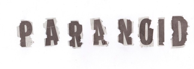
Tearing newspaper cut out letters to form the song name and band name. additionally, once having cut out the letters, I began to tear small areas of the words that break up the main outline of the letter. This was to add a textural quality add to relate to the themes of the song-of being paranoid; the tearing and crumbling effects of drugs and depression that may follow.
The presence of two hand is an eerie image; as though they belong to someone who is feeling isolated or trapped and are crying out for help ( As the lyrics read ” Can you help me?”)
With Ludwig Van Beethovens musical compostions, it was intially difficult to to explore ideas due to the sheer duration of the piece. Having looked at pre existing album designs of Beethovens 9th Sym, 4th Mov by composers, it was apparent that many of these cover designs were very literal in that the imagery was religious based; inspired by Mythology and the ancient world of the Greeks and Romans, and/or imagery of 18th/19th century europe.
This is understandable as the music and lyrics to Ode to Joy reminds many (including myself) of these themes. However, with my design, I wished to capture the sounds of the many different instruments and the ways in which these instruments are played; with a more abstract visual .
Coincidently, the experiments of patterns I had used for Amaranthe and Def Leppard proved to be useful for this design due to their nature being manipulated by scanning to form a more distorted aesthetic. the variations between the height of lines and shapes of the pattern reminded me of the variations in classical musical compostions and the terms used such as Adagio and Accelerando.
Using imagery of the sheet music of the 9th Symphony 4th movement, I layered this over the pattern design and applied a filter in Adobe Photoshop so that the sheet music imagery would be contained inside the shapes of the pattern design.
The sheet compostion for the 9th 4th. only a small percentage of the notes, symbols and lyrics would be visible in the design due to the form and capacity of the pattern below. However, I think this benefits the overall design as it does not allow it to become too busy with different aspects of imagery.
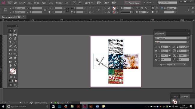
This photoshop screenshot shows how the imagery has been layered and organised so that only a small percentage of the sheet music is showing through the pattern design.
Regarding the typography for the album design, I decided just to use single digits instead of long words as I did not want to overcrowd the overall design with text as I had seen with other designs while researching. Therefore, I used the process of mono printing to produce both the english/modern numbers and latin numerals. I intially decided to choose the contemoporary numbers as these were clear and instantly recognisable. However, one felt that the numerals looked visually more appealing and related back to the themes of ancient civilizations such as the Greeks and Romans and thus I selected the numerals instead.
By inverting the image using the software Photoshop, the design is dominated by black. The contrast of white and black remind me of the black and white keys on a piano. However, as the black is very dominating using this invert, it does not seem befitting to the themes and natue of the music and especially the lyrics as they reference heaven and god, light and the sun.
The Wanderer is a blues – rock n roll song released in 1961 by American singer Dion Dimucci.
Keywords, themes and ideas that this song reminds me of include travelling and adventure, the great American deserts and environments, driving a a car or motorbike on the great highways and routes of America, patriotic, american free spirit.
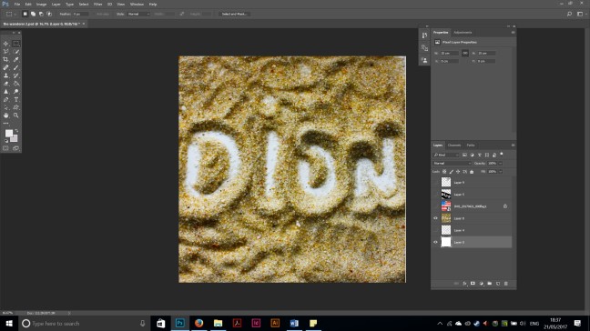
I was particulary interested by the ideas of a lone adventurer travelling in the wastes amd deserts of Colarado or California. I managed to aquire some sand (sand that was from the beaches of far away Rio de Janeiro in Brazil) to explore using . I quickly discovered that I could potentially use this sand as a medium to create letterforms.
Using nothing by fingers and the end of a paintbrush, I was writing the name of the song title and singer in the sand. It was apparent that too much sound makes writing more difficult as the excess sand that is brushed aside when writing falls back into the space from its intial position. Therefore, I took great care to estimate how much sand was needed on the background surface.
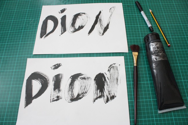
Ink and brush was used for additional typographic experiments. With these, I used the brush and ink in such a way that produced a rough and rustic aesthetic to the type that suited the themes of adventure and the imagery of a lone ‘wandering’ travelling the great American environments such as the Great Plains, or Mojave Desert.
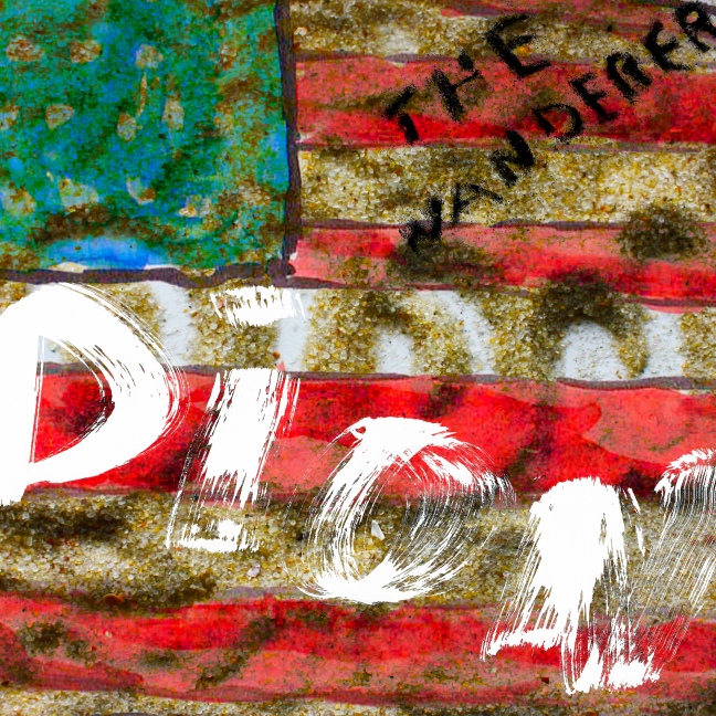
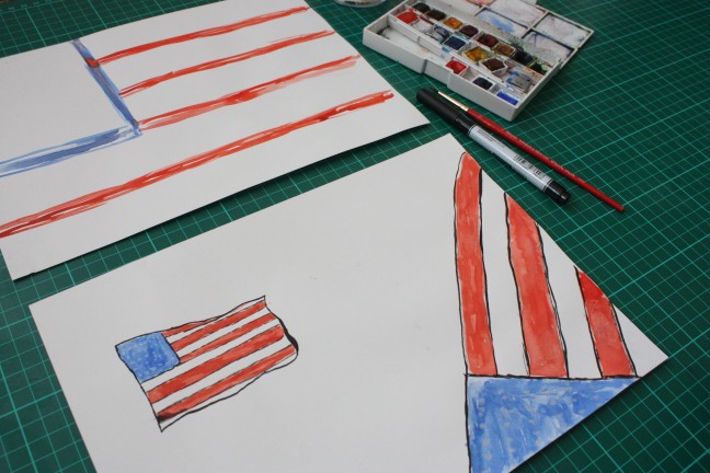
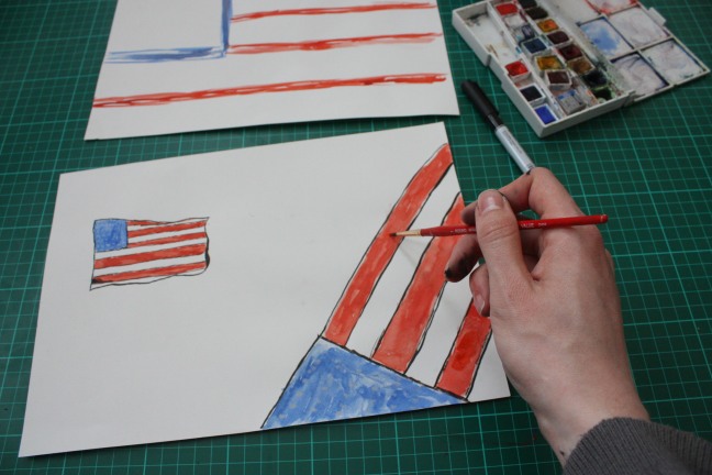
Using another type of medium , watercolour, I began to paint quick drawn sketches of the American national flag (The stars and stripes). As the Dion is American and song reminds me of American Patriotism, adventure and spirit, I deemed it necessary to include the national flag in someway as it encompasses the American way of life aswell as the historic attitudes of resistant, risk and spirit that gave birth to the United States of America.
I purposely drew and painted the flags in a way that was rought; if not crude, with imperfections as this added to the themes of adventure and hard work.
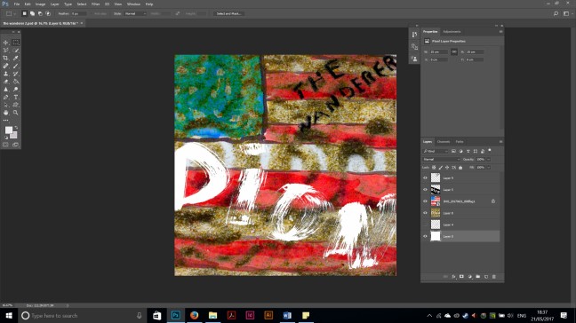
Having finished my hand rendered experiments, I scanned these in digitally and began to produce possible compsotions by combining these. Using filters and layer masks, I was able to produce a design that looked effective and retained all the original features of the experiments. For example, The grains of sand in the sand experiments could be seen behind the simple lines and colour of the American flag.
The letterforms in the sand and the letterforms in front give the impression of the word Dion rising from the sand and ground; perhaps a type of letteform footprint.
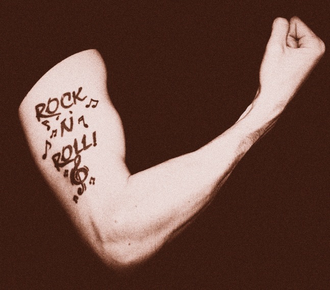
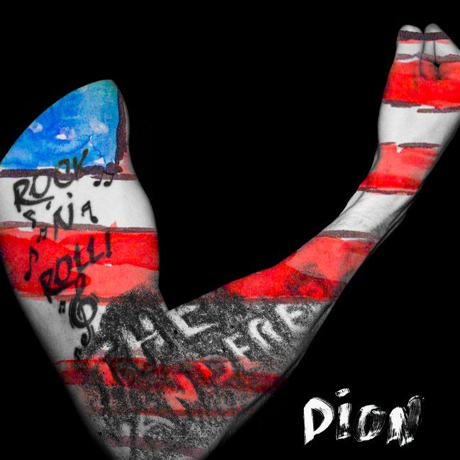
With this second idea, I was assisted with photographing the tattoo on my arm. The tattoo reads Rock N Roll as this type of music (in its different forms throughout the last 50 years). I felt the image of an arm with tattoos represented strengh, resistant, perseverance and was something that one may view as quite cliche and american.
However, it was decided that this would not be the final design as the design with the experiments of sand felt more symbolic and relevant to the lyrics and themes that I felt was the song.
The vintage and old effect which I applied to this image was created using layers and filters on photoshop. This seemed appropriate to apply as it puts the time peroid of when the song was produced into context.
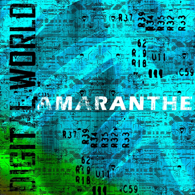
A song released only a couple of years ago, the melodic heavy metal – pop band Amaranthe is unique in that in consist of not just one, but three singers who all have a different style of singing to one and another, but when combined together, all compliment each other and the sound of the band with their instruments.
Digital World is a fast tempo that contains pauses in the song and after the chorus where the sounds (instrumental) resemble that of electricty or digital equipment . With this mind, I began looking for objects of a technology nature that require energy/ electricity . These included purchasing objects that contained ciricut boards and components such as a televsion remote control, computer mouse and motherboard. By disembling these and photographing and scanning the components, I was able to develop these using digital software.
I produced rubbings of these objects by placing paper over the circuit boards and gently rubbing the surface with charcoal and graphite. This made impressions on the paper of the different shapes of the circuits whereby components and small numbers could be visible. However, due to raised components of the circuit boards, it was difficult to produce rubbings of the whole circuit board as the raised components would prevent the charcol and graphite from rubbing certain areas of the board.
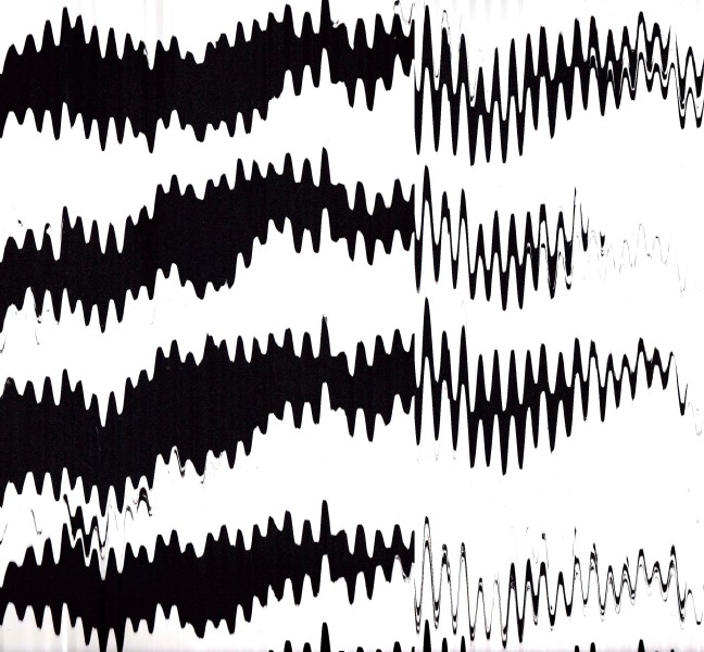
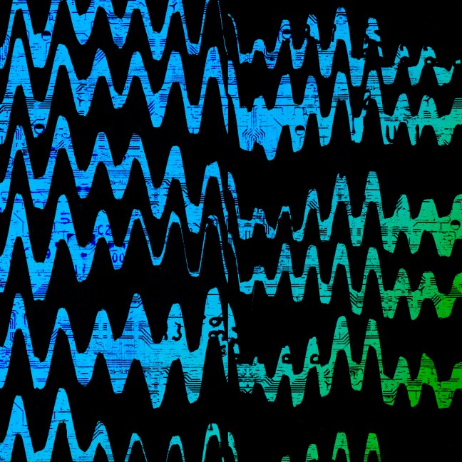
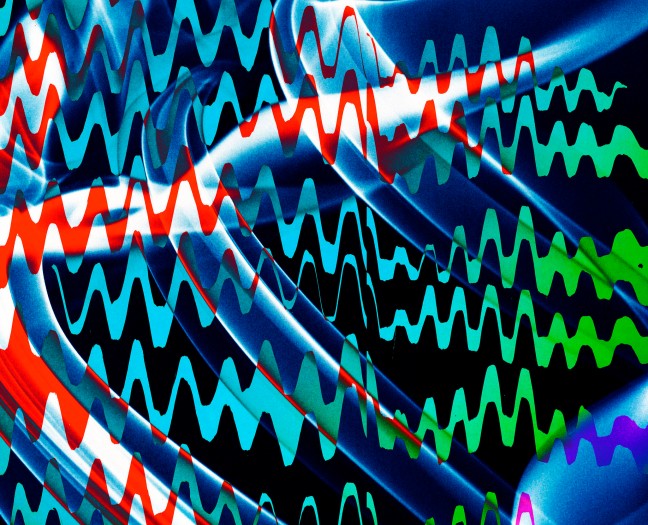
I decided to reuse the torn paper stripes pattern from the Def Leppard Animal design. However, this time, when scanning the pattern in digitally, I started to the move the paper up and down, side to side while scanning. This created a distortion effect that absoliutely changed the pattern from the original idea of an animal pattern, to one that looke static, electrical, digital , wavelengths.
The blue and green tones were from a Cd which I had also scanned. Due to the refelctive side of the cd that creates a colour spectrum, I thought the blue and green were neccessary to symbolise the world / earth (Digital World). Earth has a greater percentage of water than land and therefore, felt it was important to represent this minor detail through the percentage of blue and green in the design.
The distorted pattern from scanning torn paper created a design that perhaps resembled the elements of wavelengths, technology. The circuit board imagery was layered using filters so that the dispostion would look within the waving patterns. I was pleasently surprised by this experiment and began to see the all the elements begining to come together into one, overall design.This design was using the same pattern but adding different filters to alter the colour. I decided against this design as one feels that the various colours and patterns overcrowd the compostion and are somewhat distracting.
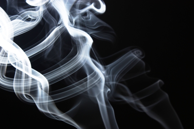
In addition to the experiments above, I also attempted to explore using smoke from incense sticks and photographing them. This is something I have attempted before at college but the curvaceous flowing shapes that the smoke creates is unique in that everyone of them is different depending on the angle to photograph from, the background and the number of incense sticks. By cropping into these photographs, I could focus on more abstract lines and shapes created by the smoke that I felt resembled electrical currents and flows or elements involved in digital technology.
These were two other designs The left one involved combining imagery of the incense smoke andd the compostion on the right involved using a metallic background instead of colour. I feel that the desigsn with colour work best as they create more of an impact; they are more visually attractive.
The typography was difficult to decide as I wished for a typeface that was interesting but minimal so that it would not distract from the pattern of the main design. The typeface I had drawn using marker pen was simple but the small imperfections in the straight lines gave the typeface a digital/ electrical feel. This connected with the same style as the pattern design with its wavy lines.
As I felt these two designs were strongest in their communication and visual appeal, I decided to select both of these as final designs for this song.
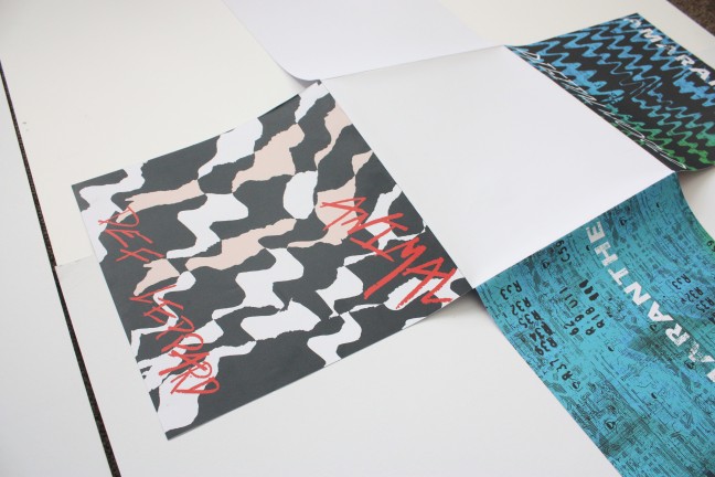
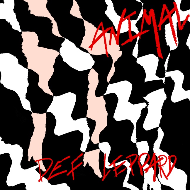
For this album design, I wanted to combine the imagery of a wild animal or beast with the imagery of lust and sex appeal. steming from Def Leppards previous songs for which some of them generates themes about life, love, lust and generally enjoying life, I wished to communicate this within this design for the song animal.
I intially started by experimenting with plain black and white paper; tearing piece of paper in an aggressive manner so that they would appear torn and rough. By mounting these black strips onto white paper, it gave impression of a striped pattern found on various animals furs. The contrast between the black stripes and white background was minimal but effective
After scanning these into Adobe photoshop, I explored layering the patterns on to of each other to create a more abstract visual. Upon doing this and to my surprise, I notice dthat by layering multiples patterns on top of each at different angles, created individual shapes and imagery within the pattern
I noticed shapes emerge that had the resemblance of two pairs of legs . By adding a skin tonal colours to some of the shapes while leaving the rest as they were, the natural pattern created what seemed to resemble female legs in high heeled shoes.I felt this was a perfect symbolism for the lyrics of lust and love; the animal within a lustful women.
Regarding the typography, tt was apparent to me that the usual and rather more conventional medium of charcoal, pen, pencil and ink has been used in much of my work. Therefore, reminded of the words and themes within the song, I bought a pink makeup lipstick to explore writing with.
This was a new medium that one was curious about using and the results it could potentially yield. Furthermore it seemed appropriate to me; giving the the themes of the song and the design that was progressing.
The results of the lipstick were successful as they had a textural quality to them and once again, symbolised the themes within the song more so than perhaps other medium such as pencil or pen. The vibrant pink colour lipstick naturally relates to sex appeal, lust and love.
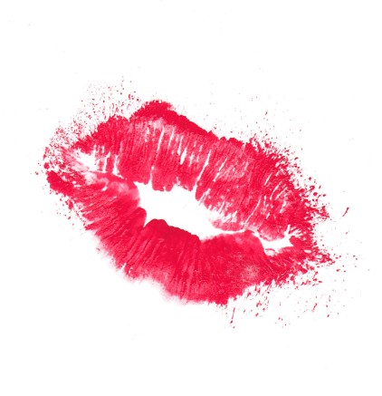
In addition to the lipstick, I has also explored using the imagery of lips using red block printing ink to add to the design. However, I felt this was overpowering and uneccessary and would overcrowd the compostion with too much imagery and therefore, this was not included in the final design. caption
With the final design, I decided to change the colour of the lipstick from pink to red. I felt the red complimented the contrast of the white and black pattern background better than the pink, but still communicating the themes of lust.
The personal voice project is one of great importance for my semester two assessment. Therefore, I felt it was essential that I choose a subject area that is interesting, motivating and can stimulate work and experimentation.
As I enjoyed the music workshop in the previous few weeks, I decided to base my personal project on this by designing albums covers for a selection of some my favourite musical compostions. These ranged from different genres of Heavy Rock/metal, Rock N Roll, Blues, and Classical.
As with the music workshop, I systematically wrote down keywords, emotions, everything and anything that I was reminded of when listening to each musical compostions. These would also decide which medium to use for each song and how to implement them.
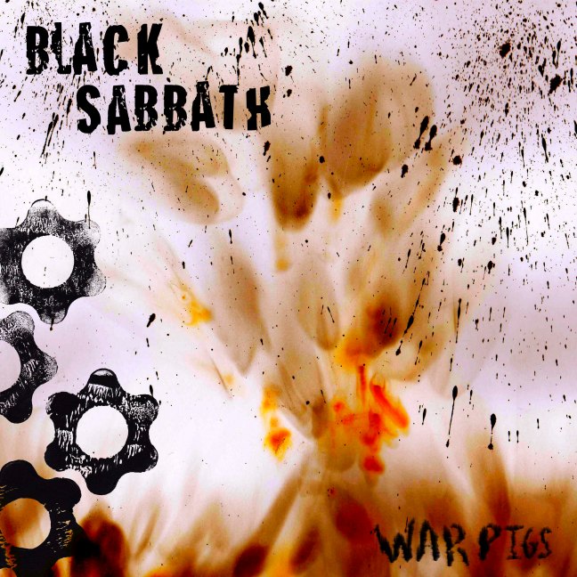
For example, Paranoid and War Pigs by Black Sabbath reminded one of war, destruction, mechanical and industrilisation ( As the band themselves were born and raised in Birmingham – a city of heavy industry and of the poor working classes of society.)Therefore, I started to collect objects and photograph that represented these aspects of the band and the song.
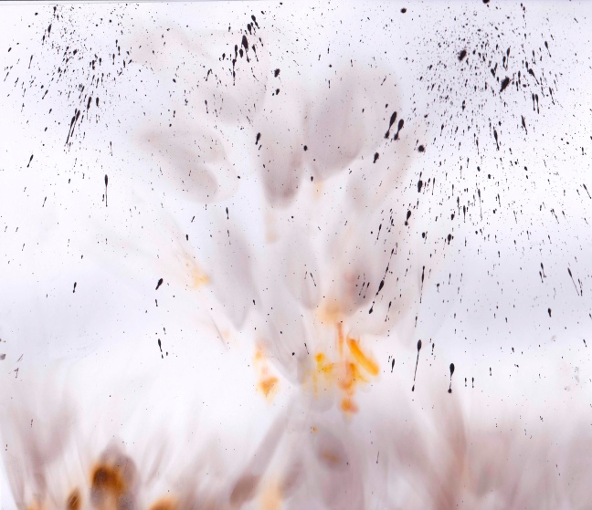
Nails, nuts, bolts, and spinlocks, tools, were objects I used to explore with ink, paint, charcoal, graphite. The use process of burning of paper using matches/lighters one found to be quite successful when used in a controlled manner.
Locations around Brighton, including a building that was in the process of being demolished, provided me with imagery that reminded me of the song ‘War Pigs’ through its lyrics, and the sounds from the guitars and drums
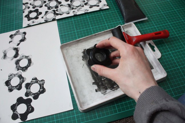
the spinlocks of a dumbell weight combined with ink reminded one of the cogs of a machine or other industrial equipment . Indeed in the song War Pigs, the lyrics “as the war machine keeps turning” felt visually communicated by these spinlock prints.
Regarding the typography for the War Pigs cover design, using ink with different brush strokes created a style that would be befitting to the overall design and compliment the imagery used. I decided to use the first style as this had a smoke and tattered aesthetic – an aeshetic that would relate to the themes of war and destruction.
the burning experiment from the previous workshop proved to be useful for the War Pigs design as it was the perfect visual interpretation of the songs lyrics and was fitting to the themes of war, burning and destruction .