Typographic Practice Project. / Studio Text

This project focuses on a set studio text – ‘Applying Lessons of the Future Today’, an academic piece of content of an article by Jon Wozencroft in which Jon examines and analyses the way in which the excitement and progression of technology blind us and could potentially cause our downfall through and scientific and technological dictatorship.  Throughout the  article, Wozencroft references Aldous Huxley and George Orwell and their novels Nineteen eighty-Four, respectively.

brief

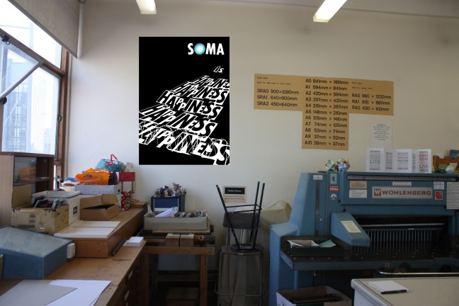
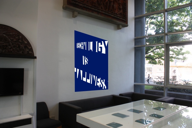
Although I have not read the novels, upon some quick research of both, I felt most interested and curious regarding Huxelys theories in Brave New World. In a Dystopian world, in order for the ruling society and regime to keep control and stability, people are given  a drug called Soma, that makes them happy, content, calm and the feeling that all is wonderful and perfect. In this world, people have been conditioned to feel and think since birth, by the regime. They believe this life is freedom even though, they dont have the knowledge of what freedom is. They are therefore isolated; imprisoned by this drug.

studio text page 1studio text page 2

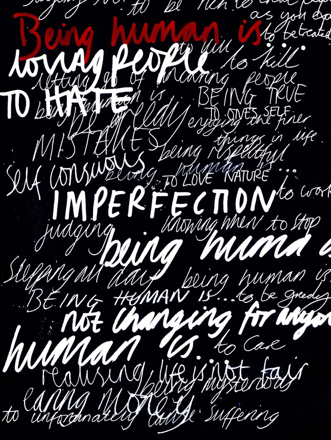
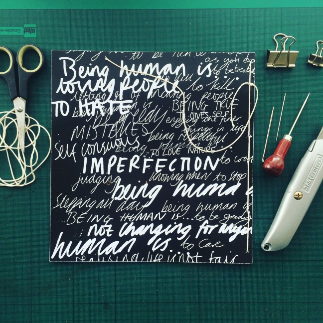
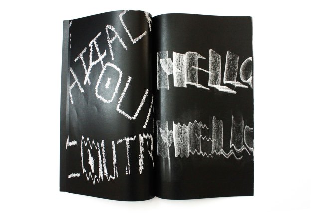
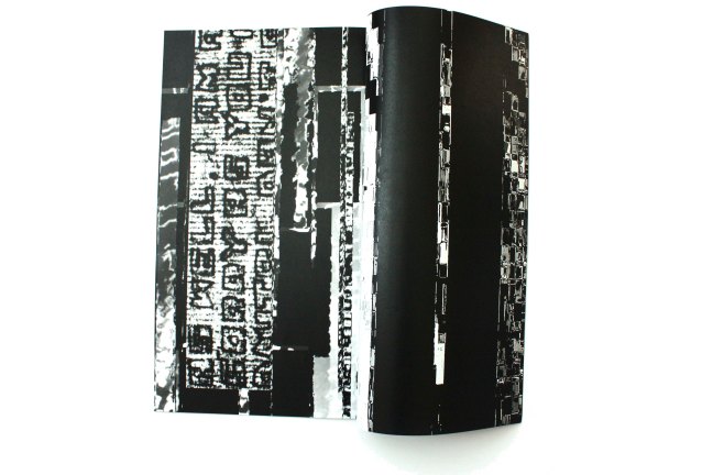
I decided to explore and experiment with the novel, ‘Brave New World’  intial starting point.  Choosing words and slogans from the novel and adapting them to form my own, I started to produce collages by cutting out letterforms from newspaper and rearranging them all individually to create phrases and slogans. It felt appropriate for one to use newspapers as this medium has been a means to promote ideas and knowledge since the invention fo the printing press, and as a way to control society.

By using pills and tablets from vitamin containers,  I was able to create photograms of these pills. The natural roundness of the pills created bold circular shapes on the photographic paper when exposed to light.  Experimenting with the dispostion of the pills, I was able to create words and phrases whereby, (rather tediously) arranging the pills into letterforms on the paper and then exposing to light.

photogram2.jpg
I created this photogram using my face. Double exposure of the photographic paper meant I was able to duplicate my face and head  twice on the paper.

Although similar results could possibly be obtained using digital software, producing the imagery via this photographic process is for me, undoubtedly, far more interesting. The results from these photograms soemtimes show different amounts of shadow from the pills surface depending on the aperture and time of exposure. This creates dynamic and varying results.

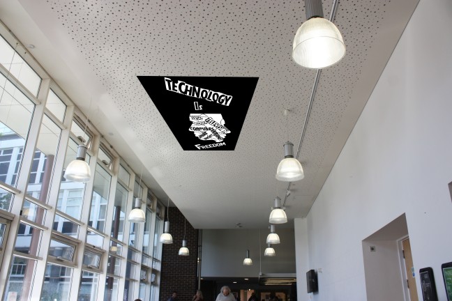
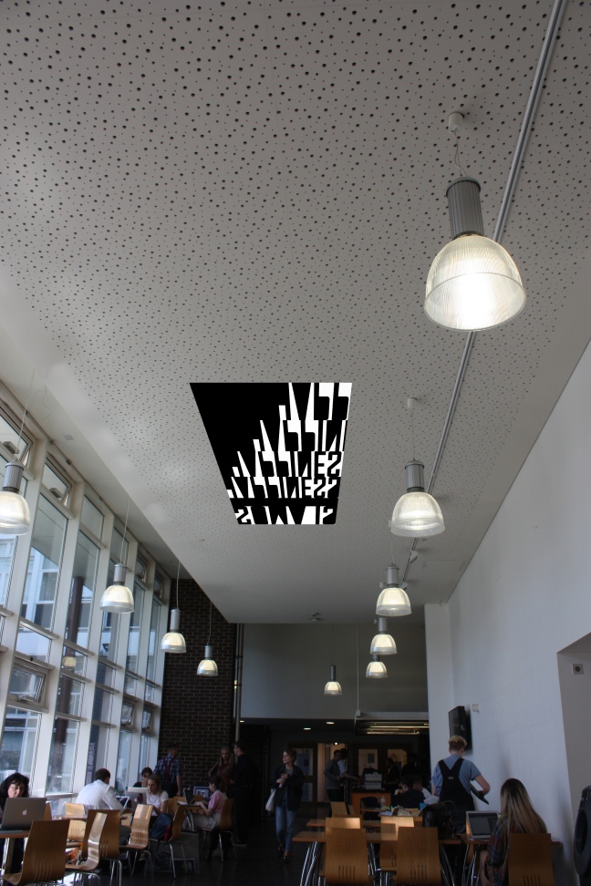
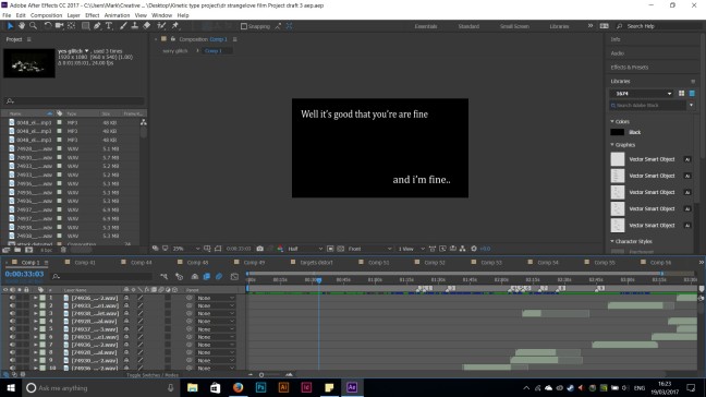
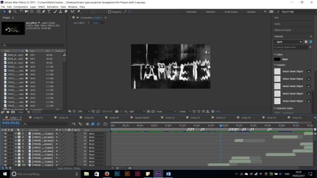
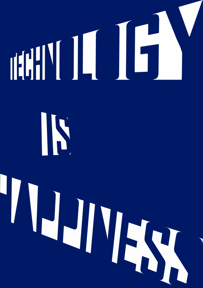
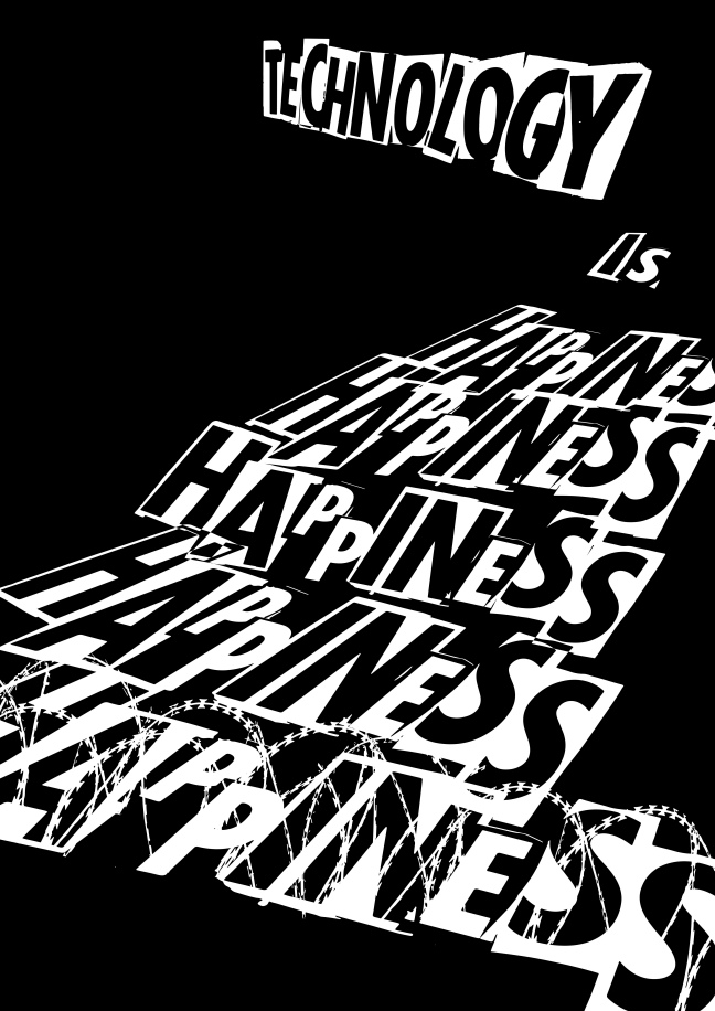
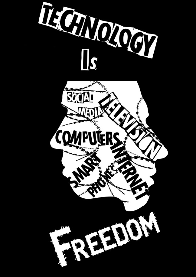
As with most work, I scanned these experiments so I could develop them further digitally.  Similar to Brave New World , I wanted to develop the themes of technology. Like Soma, technology can (and is) be used for control, balance and totalitarian means. I wished to highlight and communicate how this great abundance of technology (television, computers, the internet, smart phones) is gradually decaying the human mind and society.  Technology is freedom and has provided our world with incredible oppurtunities . However, like the drug Soma, it  has almost become a false reality. Society feels happy and content with this abundance and at the same time, are platforms for various media to exploit.


 I feel that I have not explored all possible ideas and development for this  projects due to time restrictions ( preparding for assessment submissions) and therefore, one could potenitally return to this project as a continuation within my final year of university.


soma is happiness letterforms repeat pattern

SOMA blue pill with wire
Happiness is repeated as though the message is contionoulsy being embedded into society but is  but this parth is really imprisonment and control as represented by the barbed wire and  engulfs happiness.
design 4 soma makes us happy
although the brief states this is predominantly a typographic project, imagery can be used where appropriate. The pill photograms used in this design reminds me of a brain and eyes;  the soma drug that is affecting the mind of false happiness and the ever watchful eyes of those in control at the top of society and the regime.

design 5 cut outs white letterforms technology happinesstechnology is happiness wire

design3 technology is freedom
The photogram of my own face and head was used in design for a more literal message to be communicated. the different platforms and objects of technology are fully embedded within minds. I rendered the word ‘freedom’ in a way that was contradicting with the typeface having a barbed wire, and sinister aesthetic.


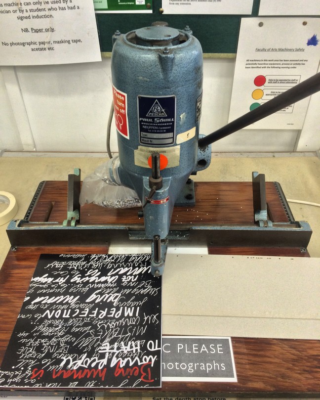
For the final outcomes, I was unable to print them all at the full scale of A2 and A1 due to high costs. Therefore, the posters I did print are of a smaller scale than what they would be in reality.

To demonstrate this, I took photographs of the university in areas which could accomodate posters of a large format. By using Adobe Photoshop, my designs were then digitally edited into these photographs.

poster in environment 6poster in environment 3poster in environment 2poster in environment 5poster in environment 4poster in environment 1

Music and sound workshop – a visual response

As part of my professional practice module,  I was given the task of creating 25x25cm album cover designs for  a dozen musical compostions by using  my own interpretation, thoughts, emotions, feelings and anyhting that reminded me of the music.However, there were restrictions. These included not using the name of the band/singer/composer and the title of the music.

After listening to all the songs (some I recognised, whilst other’s I did not), I decided to select Borders by Emptyset. I chose this as this would be classified as an instrumental piece – a musical compostion with no lyrics and just sound from the instruments.

1zlr9geu.jpg

The music could be viewed as mundane or uninteresting for this reason. However I found this to enhance the challenge of visually interpretating as an album cover.  The music itself is dark, heavy -industrial sounding and eerie – like the soundtrack to a nuclear war. With this in mind, I started to experiment with objects and markmaking that could produce experiments marks, patterns and designs that of these that could be associated with these thoughts and ideas.

Using the spinlocks on a pair of weight lifting dumbells and block printing ink created imagery that reminded me of industry, war machines and technology. The prints looked similar to the wheels or cogs of war and industrial weapons.

Another process that reminded me of music included fire and explosions. Therefore, by using a packet of matches and a cigarette lighter, I proceeded to burn and char thick paper. This created many scorched marks on the paper of various black, brown and yellow tones. I attempted to scorch the paper in a way that would create the shape of an explosion or mushroom cloud from bombs and nuclear weapons.

To add to this visual, I used a paintbrush to flick black ink above the mushroom cloud of smoke to resemble debris and black radioactive rain as has been documented in reality of nuclear capabilities ( The bombings of Hiroshima and Nagasaki in 1945)

As titles and artist names were forbidden to use during the workshop, I decided to choose  a couple of words that overall summed up the thoughts and feelings that I felt  the image represents. By crudely cutting these letterforms from newspapers and combining them together to make the words “Hell” and “Death”. Two words that have often been used by many to describe war and catastrophe.

I enjoyed this workshop as it allowed me to use my imagination and own thoughts of a piece of music that perhaps is not conventional by current music popularity and trends. The exercise of using objects for mark making had been both useful and pratical and will be an element to consider for future projects.

record sleeve final.jpg

Manifesto project – new idea

Having discussed with the others in my group, it was apparent that not all  members were content with the social media idea. After a discussion, it was decided that we should all work individually as we could not all agree on a finalised idea.

Now working individually, I felt this provided me with much more depth and scope allowing me to control this project.

Using some elements from the old idea of social media, I started to reflect on the idea of what it means to be human. What does one do or not do that makes one human?

As an intial starting point,  I asked people ( friends and family,) the simple and open question of what does being human mean. To coincide with the answer, I instructed the participants to write down using a black pen on the same piece of paper as everyone.  This resulted in a wide variety of answers that were cliche, abstract and intriguing.

As people wrote on the same page as eachother, the varying styles of handwriting provided an interesting typographic compostion and insight that was a a design within itself – to be human is to to write with a tool and  by using our hands.

handdrawnbeinghumanisdesigninvert - Copy

I then chose a select few of the answers and worked on individual designs for each using various analouge processes and medium such as ink, graphite, charcoal and paint, burning.

I felt hand rendering designs to be far more appropriate as it relates back to  the idea of being human; using ones hands to craft and create a more personal theme. These designs were then scanned in digitally to be edited and prepared for printing.

Early on during the intial stages of the project, I was keen for my final outcome to be a book as it would be similar to a genuine format for a manifesto and once again, creating a book seemed appropriate, (as humans, using our hands and knowledge to produce such tangible objects).

When selecting the words to  design indvidually, I considered words that could be paired; that were opposites/ contrasting answers. This included the words

Greedy – Generous ,

Brave – Fear,

Stop – Go

Build – Destroy,

Love – Hate,

They would also be on opposite pages to eachother within the book layout that added a cohesive narrative. The idea was to include words that are both postive and negative and to say that being human nature can be wonderful, but it can also be terrible.

When the book had been printed and was ready for binding, I included small tip ins with instructional words such as ” Is to be” and “Is to”.  By adding these words, this transformed the idea with a greater emphasis of a manifesto.


For example – Light Green often represents generousity and red often represents love but also aggression and anger (Hate)


When preparing the pages to be drilled and bound into a book, it was important that the holes were drilled accurately . The additions of small tip ins inbetween the main pages of the book proved this to be rather difficult as they were often displaced from their postion in the book due to handling and measuring. I found that using bull dog clips to hold the pages together while I measured and drilled to be an adequate solution to this problem.


book binding completedrilling of book

Manifesto project intial idea.

The Manifesto project was a project that could be very broad aswell as very minimal in its ideas and content.  The most obvious starting points were of a historical or political nature and working in a small team of designers, we decided to create an idea that invilved social media and how society complains on social media about their day to day problems and tribulations.

Focusing on twitter, we researched peoples tweets that demonstrate a somewhat greedy, exaggerated and selfish mindset.

(https://www.buzzfeed.com/lukelewis/middle-class-problems?utm_term=.vjRBkYwZ92#.toP3akw5QZ)

we found websites such as the one above whereby, peoples tweets were collected – especially from those deemed to be middle and upper class who often exaggerate trivial problems on social media.

I looked at the absurdity of these tweets and although humourous, the nature of these were selfish and absurd when contrast with real problems in the world such as drought, famine, poverty and war. As a group, we wished to visually represent these contrasting opposites

Using the tweets found on social media and using imagery representing warfare and drought, the contrast with this was thought provoking.

Kinetic Typography Project – Adobe After effects and Book Final outcome.

The next step after scanning in my designs was to develop them in photoshop. I quickly learned that many of the experiments had a more bold and impactful contrast when the image was inverted so that the white background would become black and the typography itself, would become white . Therefore, I chose to implement this for the majority of the experiments.

IMG_8005IMG_8012


When one thinks about creating a film  or  animation of any kind, fluidity is very important. I began my animation by importing an mp3 file of the  conversation scene from Dr Strangelove. My idea was for the conversation to start in a polite and friendly manner; gradually becoming more sour, impatient and awkward. Therefore, it felt appropriate that  the tyepface for the start of the conversation was rather minimal ( if not mundane). As the conversation starts to gain pace, I inserted my hand renedered experiments with the more legible experiments intially at the start and the more illegible ones towards the end of the animation – communication would almost breakdown completely that the text is barely recognisable.

I addition to the experiments, I also discovered a visual/ communication glitch effect on the internet. With a few steps in the ptrocess, I was able to create a distortion effect for my hand rendered experiments; emphasising further, the communciation breakdow

after effects screenshot 1after effects screenshot 2after effects screenshot 3after effects screenshot 4


Alongside the audio of the conversation, I felt it would also be realistic to add  some commuincation  sound effects often heard with old radios, televisions etc. These sound effects would become more dominant towards the end of the conversation. Intentionally, at certain times of the animation, these crackling sounds are all that the audience can hear.


As well as  the final outcome of an Adobe After effects animation, I felt the addition of a printed object that contained the typographic experiments would also compliment the animation.

Producing a printed booklet in the same narrative and style of the video not only provides the audience with a tangible object, but also places focus on the successful typographic experiments and the different medium that was used to create them.

Similar to the video, the booklet starts off with a calm friendly conversation using a conventional, if not mundane typeface. As the conversation becomes more heated and passive aggressive, the typography transforms into the experimental letterforms.

IMG_9579

IMG_9580

Using still images from the animation itself and converting these into a Jpeg format, I was able to include the glitch and chaotic effect produced in Adobe After Effects, into my book towards the end.


IMG_9581IMG_9582IMG_9583

The measurements of the book are somewhat unconventional from standard book sizes; 20cm x 42xcm, which gives the book a long and slender aesthetic that reminds  perhaps resemble the large documents containing classified and secret information by Cold War officials during this time period.

IMG_9578


Kinetic Typography – development and more hand rendered experiments.

In continuation with  typeface experimentation, I was keen to produce more of my own hand typopgraphy; this time, without using the the downloaded digital Grinched typeface and instead, focusing on creating my own in different medium.

Having recieved feedback, positive comments went primarily towards the hand rendered and distorted experiments and therefore, I was urged to produce more.

Not using any particular typeface style,  I decided to let the medium naturally produce the typeface . Using ink with a split brush and fan brush yielded interesting stroke marks and using different sides and edges of a  graphite block produced designs with a three dimensional illusion.

Once again, scanning these and manipulating them produced a  distorted aesthetic which added great difficulty regarding the  legibility of the text and sometimes near impossible to read. I felt these experiments could be useful in representing and communicating the breakdown of the conversation and change in atmosphere to one of a more panic -striken and impatient manner.


Inverting the images so that black is the background defines the text more for greater impact


Kinetic Typography – intial experiments

My first decision was to listen and watch the scene. One notable aspect of the scene is hwo the conversation starts friendly and rather nonchalant, but gradually declines into a conversation of anxiety, panic and impatience. The breakdown of communication. This was something I felt could be represented within the typography used. As the  film is set during The  Cold War, I felt it was suitable to choose a typeface that was common of this era.

Looking at propaganda posters, books and images of the 1950s and 1960s, the typeface used was very impactful in grabbing audience attention espcially when used with grammar and punctuation such as exclamation marks and capital letters. Thus I browsed the internet for these type of fonts and came across and few that were suitable. The one I chose is called “Grinched 2.0”.

I decided early on that the animation would not only include digital typeface, but also analogue type creating using printing and and photographic processes. The idea of using a simple and clean digital typeface to start the conversation, but then gradaully incorporating more hand- made rough and shattered typography as the conversation breaks down.


Grinched tyepface


Mono printing experiments

Typographic photograms, (multiple exposures)


Producing photograms and prints for the whole conversation was daunting and therefore,  not a sensible use of time. I needed a method to produce rough and breaking text which was efficient. I started experimenting with scanning; firstly printing off the words I wanted on to paper, and then scanning them back into a computer.By moving the paper while scanning, this causes whatever is being scanned (in this case, the text) to become distorted, creating abstract shapes and and forms. I felt this scanning technique was simple, quick and effective in manipulating text into almost unrecognisable forms and that certainly represented the idea of communication breakdown.


Kinetic Typography Project – intial idea.


When one thinks of a kinetic typography project, it may be that animation and digital outcomes are the obvious options to choose. However, within the brief, I was reminded that kinetic typography may not only be digital, but also communicated using  tangible and more static objects that in some way, shape or form, techniqually, encompass the movement of typography.  Take a book for example, an object where the typography is static on a page, but the simple motion of turning a page or using interacting pull tabs makes it kinetic creates movement of the typography.

I decided to produce an animation as this was a new area of design for my personally; learning the necessary software itself, was equally important as the project outcome.

The brief provided intial themes and ideas such as passages from books, famous speeches etc. I was attracted to the idea of a famous speech and thus begun looking at speeches of a historical nature. The speeches of Winston Churchill, Abraham Lincoln’s Gettysburg address and of like were speeches that I know well, in terms of historical context.

However, one has to think of how these speeches can be visually communicated through film, audio and animation.

I also looked at quotes and dialogue from some of my most favourite films. One such film was the black comedy/ satire, ‘Dr Strangelove: Or how I stopped worrying and learned to love the bomb’ by Stanley Kubrick. This movie is packed with memorable quotes and conversations produced by iconic actors such as Peter Sellers, George C Scott and Sterling Hayden. The  comical (and slightly un nerving)  telephone conversation between US president Muffly and Russian Premier Kissov ( mostly referred to simply as Dmitri) is a scene whereby mostly improvised by Peter Sellers, is a scene which is highly ammusing and somewhat terrifying; two of the most powerful men in the world,  casually dicussing the accidental launch of a nuclear attack and what they should do to abort it.

I felt this would  be an interesting subject to visually explore.


The international Society of Typographic Designers competition/project – The banned Book

The international Society of Typographic Designers, ISTD, is a professional body run by and for typographers, graphic designers and educators. Each year, they run a competion for students to enter, choosing a brief from a variety of different concepts and approaches.

After viewing  and taking in consideration of the design briefs, the one I felt most engaged and enticed by was the banned book brief whereby I was to select a chapter from any book of controvesy that has been banned at one point throughouts its publication, and to reinvent that chapter as digital interactive book format.

Because of my passion for history, I decided to choose the novel “All Quiet On The Western Front” by Erich Maria Remarque which was a 1929 novel banned by the Nazis during the 1930s as it questioned war and ultimately (in the eyes of the Nazis), perceieved the german army (and nation as a whole), as weak and inferior which contributed to Germanys defeat in  the First World War in 1918 . This of course, was in complete contrast to the Hitlers ‘strong’ Germany and therefore, was a threat to their propaganda machine.

I intially started this project by re-reading the book and deciding on a specific chapter to work with. This was difficult as all the chapters are interesting and have their own features. However, chapter 11 was detailed in its use of metaphors and imagerey, violence of war and anti war comments from the main character, soldier Paul Bauer.

Highligting key phrases, words, paragraphs from the chapter allowed me to imagine imagery which I could use as icons and interactive objects for the digital book.

img_20170111_0013img_20170111_0012

In one paragraph, Paul describes the appearance of tanks and how they are like caterpillars; crawling over the mud and shellholes. I found this interesting and thought of the idea of an innocent, small caterpillar gradually transforming into this machine of death across a digital page and reaveling the page text in the process was a symbolic image.

With these ideas in mind and development, I used a range of medium to sketch potential ideas based from the writing and imagerey. These included, charcoal, pencil, watercolour, ink. I quickly found that some medium was more useful for different images. ink was very effective at representing  a shell explosion when sprayed using the brissles of a brush.

Exploring the art of photograms, I was able to use objects that I have collected over the last two decades including blank bullets and cases, and toy WW1 figurine tanks. I am very pleased with the results which I have scanned and aim to develop further within the semester two stage of the project.


My next step is to focus on the typography of the text and how this will be implemented digitally.

Screen printing experiment

Screen printing is a process that I have always been rather curious about and wanting to learn more of. I therefore took the oppurtunity to try a second attempt at the printing process at the university of Brightons printing workshop and studio.

With some added guidance from the tutor in the studio,  I regained my understanding of the process and the steps from choosing the right mesh count of the screen, to printing and washing. The image I chose was a simple picture of a tank and a caterpillar ( to be used for an up and coming project) just to explore  the process again. I was working alongside another student and therefore, I was able to share a screen together and assist each other if necessary .

Having coated the screen with emulsion, I placed the screen into the drying machine. This meant the screen would be dryer quicker than if it was left to air – dry. Once the screen was ready, my image of the tank was placed onto the screen and secured with tape. ( the tutor advised me to to convert the image into a bitmap for future reference as this would add more detail to the image regarding the black and white areas and would have greater contrast when printing.)

When exposing the the screen onto a UV light machine, it was important to calculate the correct exposure time. This was familiar to me, having used exposure machines for photography and cyanotype printing. Once exposed, the screen is then washed with water which clears any residue and enchances image clarity ready for printing.

Intially, it was  rather difficult to know how much ink to use when printing and that a different volume of ink can yield a different results ( This became easier with practice). Indeed, the accidently mixing of water with some ink produced interesting results; creating an unclear and smudge-like  image.

I feel my images are not adequate regarding quality, this second attempt at screen printing has been a valuable  learning experience, for which I now have a greater understanding of the process and preparation involved. I aim to continue with screen printing using carefully selected imagerey .

image3434345