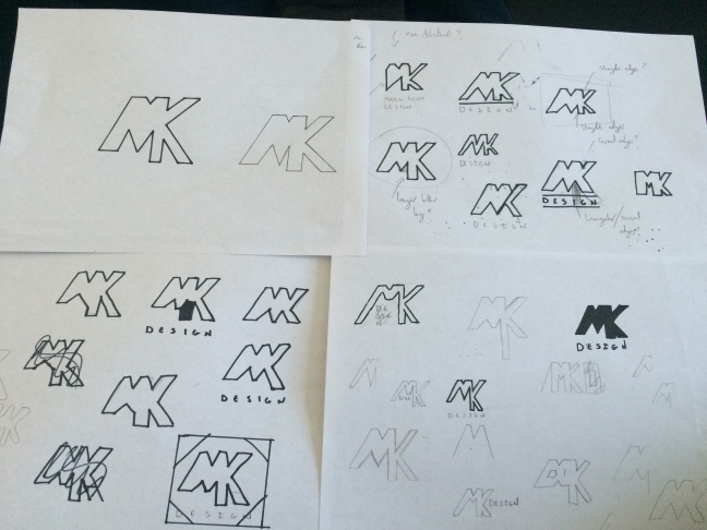
In addition to projects set by the university course, I also enjoy setting my own projects and outside work. Having set up a new instagram account as a portfolio to showcase my work, I thought designing a personal logo idea. The logo may not be a final logo, but it serves as useful practice in this area of branding and logo design.
I intially set about sketching ideas based on using the first letters of my forename and surname – m and k. Upon my intial sketching, I found that the M and K are letters that can be joined visually. Admittedly, it was difficult to think of an aesthetic message my logo would communicate as I was designing for myself without a clear specific area of design I am interested in, compared to a company or buisness that offers a specific service or message. I therefore, decided on a lettermark logo which was simple and readable.
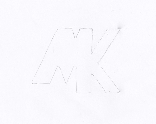
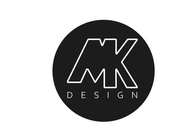
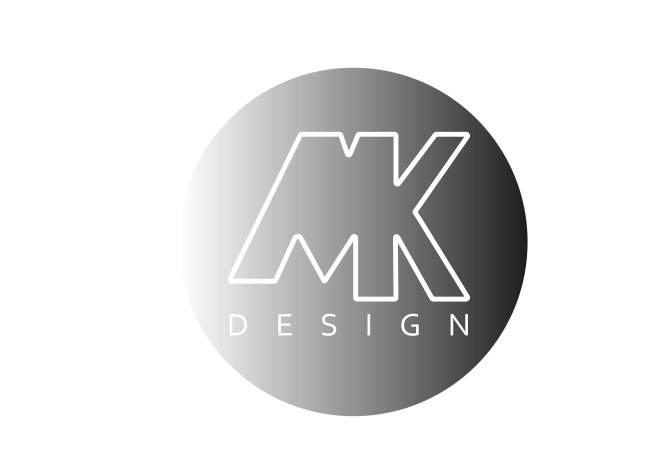
Scanning in the sketch digitally and importing in to Adobe Illustrator allowed me to edit the design and to fix minor mistakes and details. I also explored using shapes to act as a container and found that the design looked best within a circle. The colour palette of the design was experimented with includiing black, white, blue, grey. These were colours that did not neccesassrily symbolise any particular message in accordance with colour theory. However, blue is a colour that represents loyalty, trust, confidence and intelligence amongst other characteristics. Furthermore, another colour combination of black and white looked simple but professional.
![]()