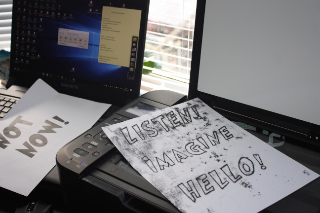
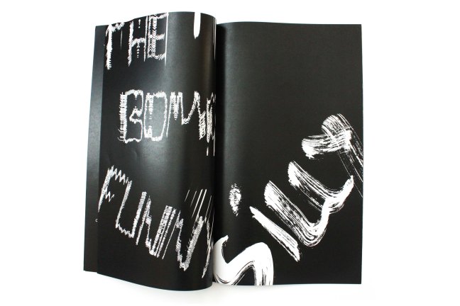
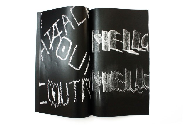
The next step after scanning in my designs was to develop them in photoshop. I quickly learned that many of the experiments had a more bold and impactful contrast when the image was inverted so that the white background would become black and the typography itself, would become white . Therefore, I chose to implement this for the majority of the experiments.

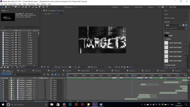
When one thinks about creating a film or animation of any kind, fluidity is very important. I began my animation by importing an mp3 file of the conversation scene from Dr Strangelove. My idea was for the conversation to start in a polite and friendly manner; gradually becoming more sour, impatient and awkward. Therefore, it felt appropriate that the tyepface for the start of the conversation was rather minimal ( if not mundane). As the conversation starts to gain pace, I inserted my hand renedered experiments with the more legible experiments intially at the start and the more illegible ones towards the end of the animation – communication would almost breakdown completely that the text is barely recognisable.
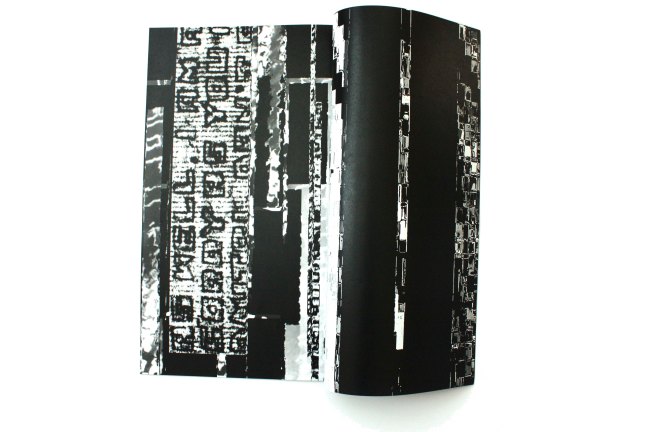
I addition to the experiments, I also discovered a visual/ communication glitch effect on the internet. With a few steps in the ptrocess, I was able to create a distortion effect for my hand rendered experiments; emphasising further, the communciation breakdow
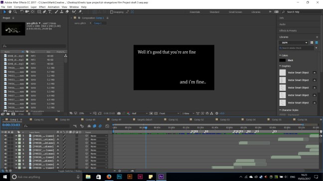


Alongside the audio of the conversation, I felt it would also be realistic to add some commuincation sound effects often heard with old radios, televisions etc. These sound effects would become more dominant towards the end of the conversation. Intentionally, at certain times of the animation, these crackling sounds are all that the audience can hear.
As well as the final outcome of an Adobe After effects animation, I felt the addition of a printed object that contained the typographic experiments would also compliment the animation.
Producing a printed booklet in the same narrative and style of the video not only provides the audience with a tangible object, but also places focus on the successful typographic experiments and the different medium that was used to create them.
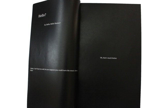
Similar to the video, the booklet starts off with a calm friendly conversation using a conventional, if not mundane typeface. As the conversation becomes more heated and passive aggressive, the typography transforms into the experimental letterforms.

Using still images from the animation itself and converting these into a Jpeg format, I was able to include the glitch and chaotic effect produced in Adobe After Effects, into my book towards the end.
The measurements of the book are somewhat unconventional from standard book sizes; 20cm x 42xcm, which gives the book a long and slender aesthetic that reminds perhaps resemble the large documents containing classified and secret information by Cold War officials during this time period.


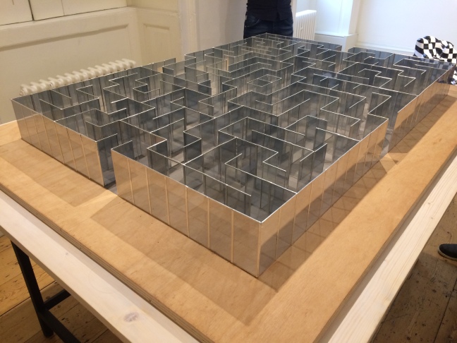
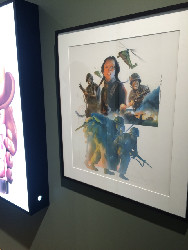
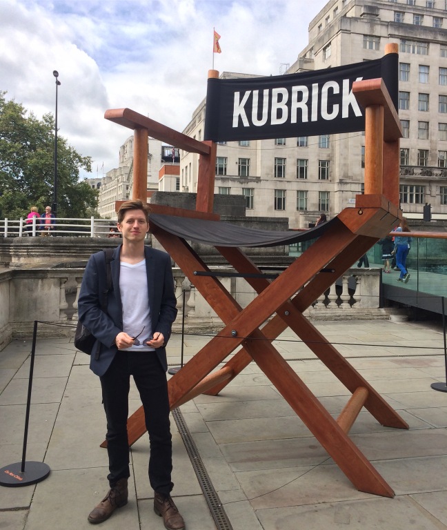
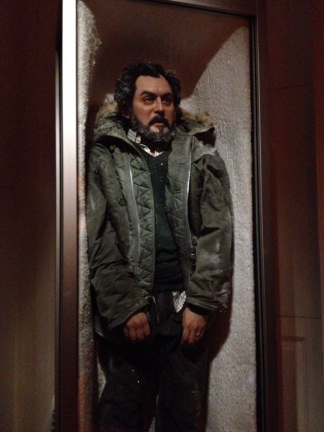
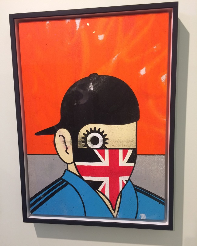
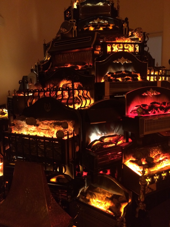 As soon as I heard name Stanley Kubrick, I knew this exhibition would be something that was interesting and engaging.